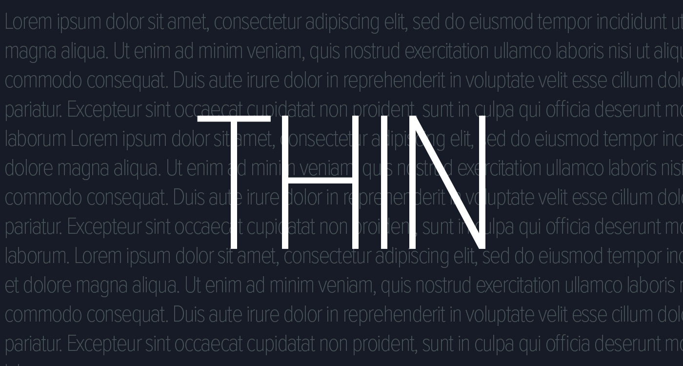
Thin fonts are like that trendy minimalist couch that looks amazing in photos but is absolutely terrible to sit on. Designers have obsessed over them for years, treating them as a symbol of elegance, sophistication, and high-end branding. But let’s be real: thin fonts are a usability and accessibility disaster.
They strain the eyes, they vanish on certain screens, and they actively alienate users who don’t have perfect vision. Yet for years, brands and designers have doubled down, forcing people to squint at ghostly text just to read a menu or a call-to-action button. It’s been frustrating to watch, but here’s the good news: some designers are finally coming to their senses.
More and more websites are quietly abandoning their ultra-thin typography in favor of text people can actually read. Apple, for instance, once pushed super-thin fonts in iOS 7, only to later backpedal and thicken things up due to user complaints. Google, too, moved away from the overly delicate Roboto Thin in favor of stronger, clearer typography.
Even brands that once prided themselves on whisper-thin aesthetics—like luxury fashion houses—are starting to opt for legibility over sheer “sleekness.”
So what took so long?
The Cult of Aesthetic Over Function
Design trends are weird. One moment, we’re all obsessed with skeuomorphism, making digital interfaces look like leather notebooks and wooden bookshelves. The next, we’re wiping everything clean, flattening buttons, and reducing fonts to hair-thin strokes.
The thin font obsession really took off with the rise of minimalism. White space, light grays, and barely-there text became the standard for what was considered “modern” and “premium.”
And sure, it looks beautiful in a controlled environment—on a high-resolution screen, with perfect lighting, when you’re sitting comfortably and not, you know, actually using the website. But the moment reality kicks in—bad lighting, smaller screens, aging eyesight—thin fonts become a nightmare.
Let’s not pretend this is just about aesthetics either. Brands used ultra-thin fonts as a status symbol. They weren’t designed for usability—they were designed for exclusivity. If you couldn’t read the text, well, maybe you just weren’t the “right” audience.
The Accessibility Disaster We All Ignored
Of course, this wasn’t just an inconvenience—it was an outright barrier for millions of users. People with low vision, color blindness, or cognitive differences struggled to read thin fonts. On top of that, many of these fonts failed basic contrast tests, especially when paired with those oh-so-trendy low-contrast color schemes.
Legally, this is a ticking time bomb. Websites in the U.S. and Europe have been sued for failing to meet accessibility standards, and typography plays a role in that. Web Content Accessibility Guidelines (WCAG) exist for a reason. Ignoring them doesn’t just mean a bad user experience—it could mean legal trouble.
And it’s not just people with disabilities suffering here. The average user doesn’t want to strain their eyes just to read your navigation bar. If they have to squint, they’re out. That’s lost engagement, lost conversions, lost customers.
The Mobile Experience Is Even Worse
If thin fonts are bad on desktops, they’re catastrophic on mobile. Small screens make already weak fonts even harder to decipher. Add in the chaos of real-life conditions—glare from the sun, dim lighting, shaky hands while scrolling—and suddenly, your elegant typeface is completely unreadable.
It’s no wonder that even companies like Google, which initially embraced ultra-thin typography, have reversed course. Material Design’s later iterations moved toward bolder, more readable fonts, because they realized that users need to be able to actually see the text.
The Slow Death of Thin Fonts (And Why Some Websites Are Making the Switch)
Thankfully, we’re starting to see a shift. Some of the biggest tech companies—Apple, Google, Microsoft—have gradually thickened their fonts in UI design. The industry is finally waking up to the fact that usability matters more than looking “cool.”
Look at Spotify. Their early mobile apps featured thin, barely-there text that was a nightmare to read while walking or commuting. Over time, they moved toward heavier fonts with better contrast. Even Instagram, once a champion of ultra-thin design, has adjusted its typography to make it more legible.
Luxury brands, too, are catching on. Some high-end fashion retailers have ditched their wafer-thin typefaces for something slightly more human-readable—a radical concept, I know.
And this isn’t just happening on big-name sites. Smaller brands and startups are also realizing that readability = engagement. Websites that prioritize usability—like news sites, e-commerce platforms, and even social media apps—are moving toward thicker, bolder, and more legible typography.
What Designers Need to Do (And Stop Doing)
Here’s the bottom line: if you’re still using razor-thin fonts, you’re designing for the past. The trend is dying. Users don’t want to struggle to read your content.
So what can designers do?
First, stop defaulting to thin fonts. Just because a typeface looks good in a static mockup doesn’t mean it works in real-world use.
Second, test your typography in different conditions. Try it on mobile, on different screens, in different lighting. If you can’t read it easily, neither can your users.
Third, embrace contrast. Light gray text on a white background might look modern, but it’s a usability disaster. Make your text pop—your audience will thank you.
And finally, push back against bad client decisions. If a client insists on an ultra-thin font because they think it looks “high-end,” show them the data. Explain how usability and accessibility affect engagement. If they still want to sabotage their own site, at least you tried.
Final Thoughts: Let’s Move On Already
Thin fonts were a mistake. They looked sleek for a while, but they were never practical. Now, as more brands move toward usability-first typography, it’s time to let go of the past.
Good design isn’t just about looking nice—it’s about being functional. The best typography doesn’t just whisper—it speaks, loud and clear.
So, designers: let’s stop making users suffer. Make your fonts readable. Make your text accessible. And for the love of all things UX, let’s put thin fonts to rest.