Fix your website’s Largest Contentful Paint by optimizing image loading
Modern image formats help reduce image file sizes while maintaining quality.
Using a modern image format can have a positive impact on the Resource download time sub-part of LCP.
The recommended modern formats are:
WebP: Widely supported and offers good compression.
You can use the Squoosh web app to convert your images to these formats.
Here’s how to serve different formats for browsers to choose from:
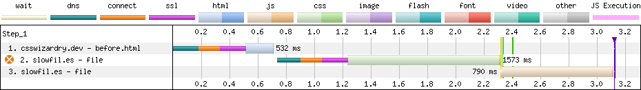
The following screenshot shows an LCP resource from a request waterfall.
While TTFB is significant, it doesn’t compare to a whole 3 seconds of content download time for the image.
Considering the lab test was run using a throttled connection, and considering this image is 1MB in size, this begins to make sense.
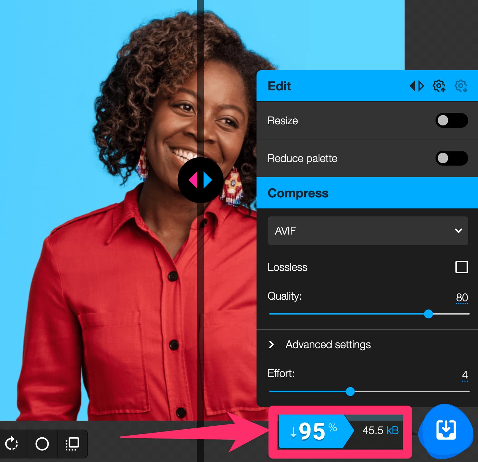
Putting the 1MB image into Squoosh, and converting it to AVIF @ 80% quality, gives a 95% saving which results in a 46KB file.
This has a positive impact on content download time.
It’s important to think about browser support when using modern image formats.
You could also consider configuring your server to serve the right format based on the browser’s Accept header.
Responsive images help you serve the right size for each screen.
This saves bandwidth and processing time.
The example uses the element to specify what image is available for various dimensions:
A small image on small screens (less than 500px wide).
A medium image on medium screens (500px to 900px wide).
A large image on large screens (over 900px wide).
This way, you don’t waste bandwidth for large images on small screens.
As a practical example, this website takes a large amount of time to download an LCP image of 2.26MB, even on a mobile viewport.
Upon further investigation, it turns out the image has dimensions of 1920 × 1080.
After optimizing this image to use a modern image format, the developers working on this website can produce different versions of the image suitable for different viewport dimensions.


