Written by Harry Roberts on CSS Wizardry.
Table of Contents
In my day-to-day work, there’s a lot of competitor analysis. Either to present
to the client themselves, to see where they sit among their contemporaries, or
me to use in my pitching process—competition is a great motivator!
The problem is, there aren’t many clear and simple ways to do it, especially not
in a way that can be distilled into a single, simple value that clients can
understand.
I have spent the last several weeks working on a new relative-ranking score;
today I am writing it up.
In the last few years, Core Web Vitals have become the de facto suite of metrics
to use, hopefully combined with some client-specific KPIs. Given that Core Web
Vitals are:
- widely understood and adopted;
- completely standardised, and;
- freely available for any origin with enough data…
…they make for the most obvious starting point when conducting cross-site
comparisons (discounting the fact we can’t get Core Web Vitals data on iOS
yet…).
However, comparing Core Web Vitals across n websites isn’t without
problems. How do we compare three separate metrics, with equal weighting but
different units, across multiple sites in a fair and meaningful way? That’s
going to be an issue.
The next problem is that web performance is not a single number—single numbers
are incredibly reductive. Whatever I came up with had to take lots of objective
data into account if it was to attempt to provide fair and honest
representation.
The other thing I wanted to ensure, if using Core Web Vitals, was that I was
representative of both the passingness of Core Web Vitals (Good, Needs
Improvement, Poor) but also the continuity of metrics in general.
That is to say, the following sites both pass all three Core Web Vitals:
| Site | LCP | INP | CLS |
|---|---|---|---|
| www.foo.com | 0.4s | 8ms | 0.00 |
| www.bar.com | 2.5s | 200ms | 0.10 |
| Difference | +2.1s | +192ms | +0.10 |
They’re both within the Good threshold, but the numbers vary dramatically! On
the other hand, one of the following sites passes all three Core Web Vitals
while the other doesn’t, yet their values are near identical!
| Site | LCP | INP | CLS |
|---|---|---|---|
| www.bar.com | 2.5s | 200ms | 0.10 |
| www.baz.com | 2.6s | 201ms | 0.11 |
| Difference | +0.1s | +1ms | +0.01 |
I wanted to make sure that any score I designed was sympathetic to both
scenarios.
My requirements for a new comparison score were as follows:
- A single number: As much as it goes against conventional wisdom, clients
and non-technical stakeholders value simplicity. - Highly comparative: The only use-case I have is for competitor analysis—I
have no interest in standalone scoring. - Rewards passingness: The Core Web Vitals thresholds should be taken into
account. - Reflects continuity: But the continuity of the metrics themselves should
be accounted for. - Firmly objective: I did not want to apply any opinion or subjectivity to
the algorithm. Each Core Web Vital is equally weighted, and other attempts to
compare Core Web Vitals tend to include non-Core Web Vitals metrics (e.g.
TTFB) and apply
custom weightings across the expanded suite of numbers. I do not want to do
this.
Let’s go!
Metrics vs. Scores
A quick note on metrics versus scores. Generally speaking, a metric, such as
Largest Contentful Paint, is a value where lower is better; a score, conversely,
is a scenario where higher is better. What I want is a score.
You will find that metrics will tend to have high cardinality and capture
a specific trait or attribute; scores, on the other hand, tend to exhibit much
lower cardinality and aim to capture a summary of metrics.
Think INP metric vs. Lighthouse score.
First Attempts
Before I began getting serious with my algorithm (if you can call it that),
I attempted some very naive early approaches. Very naive indeed. Let’s take
a look where I started…
Naive Approach 1: Ordinal Score
With the requirement to highlight passingness, an early approach I embarked on
was deriving an ordinal score: a score that offers a rank rather than a place
on a continuum.
To arrive at this score, we could assign a number to each of Good, Needs
Improvement, and Poor:
- Good: 3 points
- Needs Improvement: 2 points
- Poor: 1 point
We then sum these numbers, and the higher the better:
[1,1,1]→ Sum = 3[1,1,2]→ Sum = 4[1,1,3]→ Sum = 5[1,2,2]→ Sum = 5[1,2,3]→ Sum = 6[2,2,2]→ Sum = 6[1,3,3]→ Sum = 7[2,2,3]→ Sum = 7[2,3,3]→ Sum = 8[3,3,3]→ Sum = 9
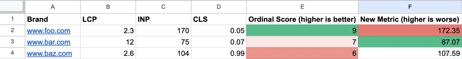
A site passing all three Core Web Vitals gets a high score of 9, whereas a site
failing all three gets a low score of 3.
The issue here is that it fails to take into account magnitude: someone
might be a very very distant second place, but an ordinal score smooths
everything out into evenly spaced gaps. This approach completely fails to take
into account the continuum. Not appropriate on its own, but maybe useful later.
Naive Approach 2: Summing Metrics
The next idea was simple: just add up the scores. Let’s take some new numbers
for foo.com, bar.com, and baz.com:
So, for a site with an LCP of 4s, an INP of 500ms, and a CLS of 0.2, the total
would be 504.2. But I’m sure I don’t need to explain to you that this is
absurd! INP is measured in hundreds of milliseconds, LCP is measured in
ones of seconds, and CLS is measured in unitless decimals—this gives
inordinate weighting to INP.
performer and the highest score to our middlemost. This is completely
useless.
In fact, we can end up with aggregate scores that are completely contrary to our
ordinal score—INP completely swallows up a 12 LCP!
Naive Approach 3: Crude Normalisation
Okay, given that our metrics are more-or-less orders of magnitude in difference,
why don’t we try normalising them?
Let’s convert our INP into seconds:

best, but we’re now awarding the worst to the middle.
Note that you’d get the same overall outcome by converting LCP into
milliseconds.
We can see that this is a step in the right direction, but there are still large
disparities between the scales. Trying to compare data this way is highly
flawed. But still, I think we’re onto something. Let’s take a deeper look into
properly normalising our data.
Data Normalisation
Thankfully, data normalisation is a solved problem. There are a few different
methods we can lean on, but given that the ranges in our data are likely to be
quite narrow (i.e. we’re unlikely to compare a 1.5s LCP to a 1500s LCP), we can
probably use the simplest: rescaling, or min-max
normalisation.
Min-max normalisation takes a range of data points and plots them in the correct
relative positions on a simple 0–1 scale. It doesn’t distribute them evenly—it
distributes them accurately.
The formula for min-max normalisation is:
normalised_metric = (metric - min_metric) / (max_metric - min_metric)
So, to normalise the 2.6s LCP in the screenshots above:
(2.6 - 2.3) / (12 - 2.3) = 0.03092783505
We just need to do this for all of our metrics, and they’ll all find their
present and correct place on a 0–1 scale, allowing for fair and accurate
comparisons.
Once we’ve done this, we end up with a new normalised column that places each of
the metrics proportionately (not equally) on a 0–1 scale:

Observations to confirm this works:
foo.com’s 2.3s LCP is correctly identified as the best (0).foo.com’s 170ms INP is correctly identified as the worst (1).foo.com’s 0.05 CLS is correctly identified as the best (0).bar.com’s 12s LCP is correctly identified as the worst (1).bar.com’s 75ms INP is correctly identified as the best (0).baz.com’s 0.99 CLS is correctly identified as the worst (1).
Anything that’s left is fairly placed on the 0–1 scale.
Aggregating the Metrics into a Score
Now, for each site in the cohort, we have three comparable values for each of
the Core Web Vitals! Remember, we want to have one score at the end of our
algorithm, so we need to aggregate them. Instead of summing, we average them.
I’ve spoken about choosing the correct
average before, and in this case, the
mean is the correct average to choose—the data is all comparable with no
outliers.
Once we averaged out the normalised Core Web Vitals scores, we were onto
something much more trustworthy!

news!
Again, some quick observations confirm this has worked: foo.com scored a 0,
1, 0 which, when averaged, comes in at (0 + 1 + 0) / 3 = 0.3333333333.
Quick Recap
Alright! Now we’re at a point where we’ve taken n sites’ Core Web
Vitals, normalised each individual metric onto a 0–1 scale, and then derived
a cross-metric aggregate from there. This resulting aggregate (lower is better)
allows us to rank the cohort based on all of its Core Web Vitals.
While we still have an ordinal score, we aren’t yet incorporating it into
anything.
Making It More Intuitive
As I mentioned at the top of the article, scores tend to follow
a higher-is-better format. That’s easy enough to do—we just need to invert the
numbers. As the scale is 0–1, we just need to subtract the derived score from 1:
= 1 - (AVERAGE(E2:G2)):

as a measure of success.
Looking at this, all numbers start with a zero: they all seem tiny and it
takes a fair amount of interrogating before seeing which is the obvious best or
worst. I decided that a Lighthouse-like score out of 100 might be more intuitive
still: = 100 - (AVERAGE(E2:G2) * 100):

as a measure of success.
Finally, let’s round the numbers to the nearest integer:

Mathematically, these scores are perfectly correct, but I didn’t like that a 12s
LCP places bar.com only one point behind foo.com.
This is when I realised that this might all be a huge oversimplification.
I decided my next step should be to start using real data. I grabbed the Core
Web Vitals scores for a series of high-end luxury brands and passed that into my
algorithm.
Real CrUX Data
While pulling latest data from the Chrome User Experience Report, a real
dataset, gave much more encouraging results, I still wanted to build in more
resilience:

this place.
The ordinal score correctly counts up passingness, and the New Score,
separately, gives us an accurate reflection of each site’s standing in the
cohort. While this looks like a much better summary of the sites in question,
I noticed something I didn’t like. As numbers were approaching 100, I realised
that the Lighthouse-like approach wasn’t the right one: a score out of 100
implies that there is an absolute scale, and that a 100 is the pinnacle of
performance. This is misleading, as an even-better site could enter the cohort
and the whole set gets reindexed. Which is kind of the point: this is an index,
and a score out of 100 obscures this fact.
The 100-based score was short lived, and I soon removed it:

I feel that, although the numbers are effectively the same, a 0–1 scale does
a much better job of conveying the relative nature of the score.
Experimenting with Weightings
The maths so far was incredibly simple: normalise the metrics, average them,
convert to a 0–1 scale, and invert. But was it too simple?
I wanted to see how adding weightings might change the results. It was important
to me that I base any weightings on empirical data and not on any personal
opinion or additional performance metrics. What cold, hard data do I have at my
disposal that I could feed into this little ‘algorithm’ that might add some more
nuance?
One bit of data we have access to in CrUX is what percentage of experiences pass
the Core Web Vitals threshold. For example, to achieve a Good LCP score, you
need to serve just 75% of experiences at 2.5s or faster. However, many sites
will hit much better (or worse) than this. For example, above, RIMOWA passes
LCP at the 84th percentile and CHANEL at the 85th percentile; conversely,
Moncler only passes LCP at the 24th percentile. I can pass this into the
algorithm to award over- or underachieving.
Now, instead of immediately aggregating the normalised values, I weight the
normalised values around passingness and then aggregate them.

N.B. It’s worth noting that I actually weighted the
scores around the inverse of percentile of passing experiences. This is
because I go onto invert the number again to turn it into a larger-is-better
score.
Utilising the Ordinal Score
The last piece of the puzzle was to work the ordinal score into the ranking.
This would act as a safeguard to ensure that there could be no scenario in
which a site in a lower ordinal could ever outrank an only-just faster site
in an ordinal above. This goes back to my requirements of ensuring we take
passingness into the new score, not just continuity.
The results of this seemed pretty pleasing to me. Remember, the algorithm is
based entirely on data, and no weighting is applied with influence or bias. It’s
all facts all the way down.

outcomes.
What I particularly like about this is that you can clearly see the density of
Poor (the red in the top-left) slowly fading across to Good (green in the
bottom-right) in keeping with the new CrRRUX score, as I have dubbed it. This
shows the effectiveness of weighting around ordinality as well as continuity.
Automating CrRRUX
For now, I have dubbed the new metric CrRRUX (Chrome Relatively-Ranked User
Experience). The only thing left to do is automate the process—inputting the
data manually is untenable.
I hooked Google Sheets up to the CrUX API and I can get the relevant data for
a list of origins with the click of a button. Here is an abridged top-100
origins from the HTTP Archive:

Again, relative to the data in the cohort, we can see a clear grading. CrRRUX
works!
In 2021, Jake Archibald ran a series determining
the fastest site in Formula 1.
Plugging the current roster into CrRRUX:

I also particularly like that, even though the scale runs from 0–1 within the
cohort, objectively bad sites will still never score high just because they’re
relatively better than their peers:

Weighting around ordinality adds a very useful dimension to the metric overall.
Conclusion
CrRRUX simplifies competitor analysis into a single number reflecting real user
experiences across a given a cohort of sites. It’s a clear indicator of
performance in the context of your peers. Clients can now get a quick
pulse-check snapshot of where they’re at at any given time. It does so without
inventing anything new or adding any subjectivity.
I’ve been refining and stress testing it for several weeks now, but I’m going to
keep the algorithm itself closed-source so as to avoid any liability.