The “switch” is a pretty common design pattern on the web. It’s pretty much a checkbox. In fact, under the HTML hood, it really ought to be an or perhaps a with just two s (or a third if there is an indeterminate state).
But unfortunately, the web doesn’t give us any primitive that looks particularly switch-like, as in, some kind of knob that is flipped one way or the other. So we use CSS. For example, we hide the checkbox one way or another, making sure there is still a discoverable clickable area, then with the :checked selector, style something that looks switch-like.
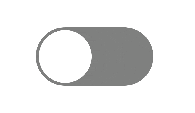
Here’s a very classic example.
I’m sure you could imagine using that for, say, toggling email notification settings on an off for some sort of app. We use them here on CodePen quite a bit, for stuff like toggling the privacy of a Pen. Or you might use a toggle to switch a site between dark mode and light mode.
Speaking of that, Aleksandr Hovhannisyan has a solid article about the struggles of a dark mode toggle. You’d think it would be pretty straightforward, but it really isn’t. Consider that users have system-level preferences in addition to your site-level preference, and you have to honor them in the proper order. Plus you have to set the controls properly as well as actually style the site accordingly, ideally without temporarily flashing the wrong colors. (FART). Aleksandr does a good job of it and links to other posts that have done a similarly good job. It’s always way more code than you want it to be, leading me to think browsers and standards could and should get more involved, but I also admit I don’t have a perfect idea on what they should do. Chrome has played with Auto Dark Mode, but it’s not clear how that trial went. (And speaking of Dark Mode, this gallery is pretty nicely done.)
Anyway, I was trying to talk about switches!
I saw Jen Simmons note that Safari is playing with a native switch. Here’s the HTML:
Nice.
And here’s what it looks like by default:

No big surprise there! It’s the native iOS toggle come to life. It respects accent-color in CSS like other form controls, which is great. But better, it has really sensible pseudo elements you can grab and style. You get ::thumb and ::track elements (nice clear naming) plus ::before and ::after work on the element itself, so there are a lot of possibilities.
.custom-switch { }
.custom-switch::thumb { }
.custom-switch::track { }

.custom-switch:checked::thumb { }
.custom-switch:checked::track { }

.custom-switch::checked::after { }
.custom-switch::checked::before { }
Tim Nguyen has demos that do a good job of showing off the possibilities with clean readable CSS.

The best part of browsers providing this kind of thing for us, to me, is that now you don’t have to worry about dinking up the accessibility. Now, as long as you follow the normal HTML structure of a labelled checkbox in a form, you’re good. No worries about the way you hid the original checkbox screwing things up. You are taking visual control though, so do take care to make sure the checked and unchecked values are at least as clear as a checked or unchecked checkbox.

