Now that we are fully involved in 2025, it’s a good time to pause and reflect on some of the things happening with website design. There are a handful of web design trends for 2025 that are genuinely shaping the landscape and will likely be something you consider or get a request to do this year.
Let’s dive into these web design trends.
1. Interactive Storytelling
The idea that “content is king” online is not new. What is new are the interactive devices designers are using to help weave these tales. With the help of everything from animation to scrolling effects to beautiful imagery, any type of interactivity that keeps a user engaged with your website is valuable.
A Bit of Beetle is a project that helps users understand the marbled beetle. While this might not sound like the most interesting web experience you might find, the storytelling here uses a combination of well-planned space with scrolling effects to make the story easy to follow. So much so that it made me want to see the accompanying museum exhibit at La Specola Museum in Florence.
2. Print-Inspired Typography
Thanks to sharper screens and an overall desire to engage with good design, more projects are using typography in a way that seems borrowed from print. Primarily, this includes type elements that overlap, include varying typefaces, or have an overall look that feels less like the blocky text experience we are used to online.
This is a technique that works best in a hero area where text elements have a more artistic feel, such as Breaking the Silence. With an animated intro, oversized lettering is the focus of the hero area. The technique is reused on the scroll but has the most impact here. This visual construct works best when you don’t have a lot of words to manage.

3. More Motion and Animated Effects
You will see it on almost every website you visit – some element of motion or animation. From floating or bouncing elements, such as those seen in the example here, to hover effects, elements that “woosh” onto the screen, and logos that spin and move, motion and animation are everywhere. And for good reason: It gets your attention.
Interstellar Web Development uses a few different bits of motion and animation. All of the elements in the main image float and bounce with the movement of your cursor. The words (Inter)Stellar have an animated glitch effect (a big trend in 2024) with movement. It works nicely because surrounding elements are simple, but be aware too much motion can be dizzying.

4. Breaking the Rules
Design rules exist for a reason; they help create harmony and organize elements visually to facilitate comprehension. But sometimes you can break them, and it still works.
Super Evil Genius seems to break multiple rules with this homepage, but it still works. (You need to click through this one to get the full effect.) There are multiple levels of animation, varying hover states, wild color choices, and an unfamiliar hover arrow, among other things.

5. Experimental Navigation Patterns
This trend has been growing in popularity and it is hard to do it well. Users are so trained to look to the top of the screen for navigation that this can be a risky design choice. Experimental design patterns can include anything that isn’t a traditional top-row option.
Doof Media opts for navigation at the bottom of the home screen with neon-style buttons, social icons, and a mic (home button) that never moves. This navigation is locked on scroll, which helps reinforce what it is and does.

6. Dark Mode
Use of dark mode continues to grow. Earthweb found that nearly 82% of mobile users prefer dark mode, and the Forms.app reported that 28% of users prefer it. The challenge is designing for it so that your brand is properly represented. Not every company wants a dark website design.
Roanoke Blacksburg Innovation Alliance solves this problem in a way that is majorly trending – the website design includes a toggle for light or dark mode. Not only can users choose their preferred color scheme, but it is designed to work within brand guidelines and not just a guess from the browser.


7. Immersive Scrolling Features
Like storytelling, scrolling features can enhance the overall website design experience and help keep users on your site for a longer period of time. Scrolling effects need to be timed with precision so that animation works with the content and makes it easier to understand. The best scrolling features are so seamless that you continue to scroll and read without really thinking about the action itself.
The(eight) includes scrolling features for when text elements come on the screen and dictates the motion of images on scroll. It’s simple and easy to understand and works with the simple black and white background well.

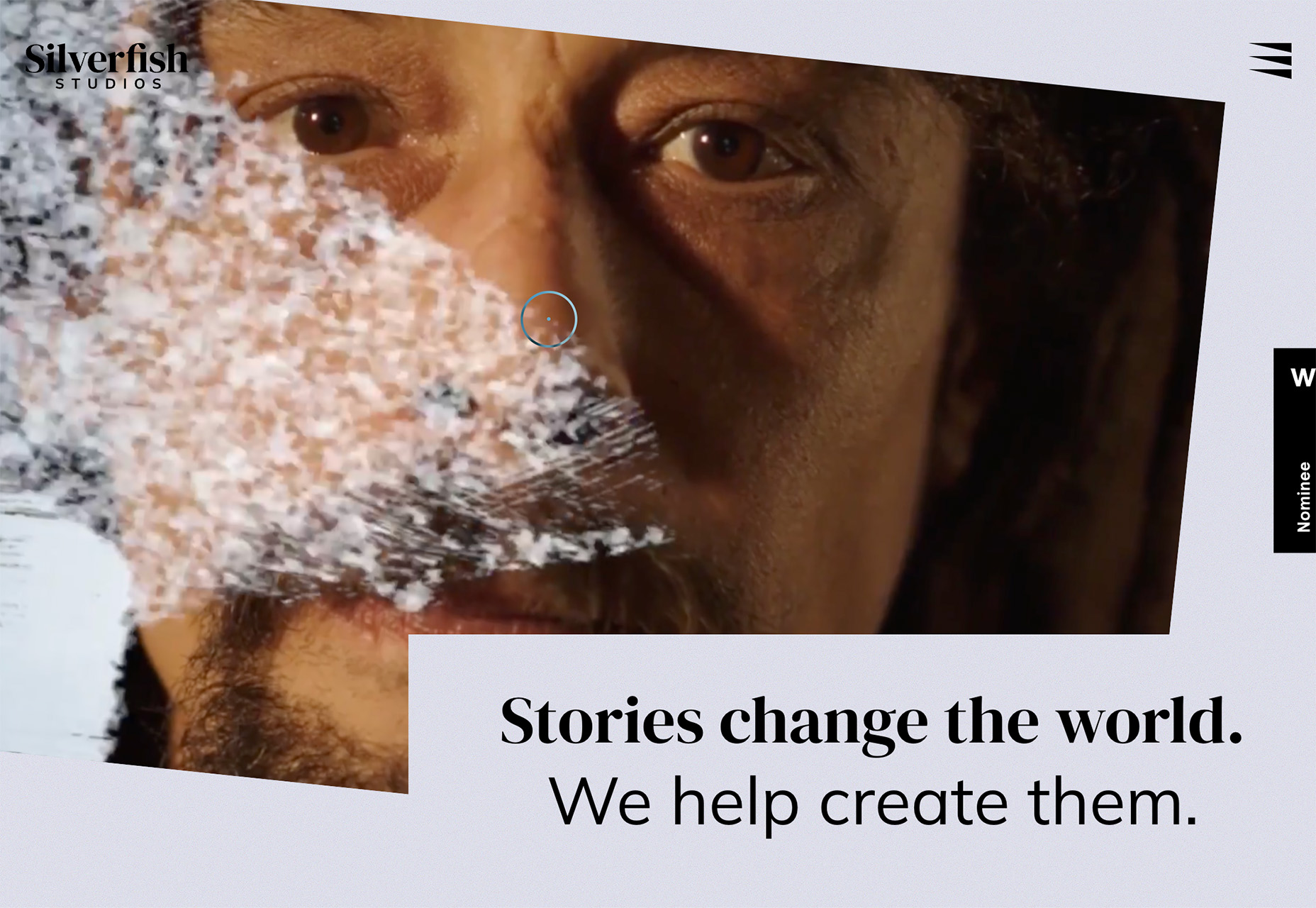
8. Break the Rectangle
Who said every website design has to be a series of 16:9 rectangles stacked on top of each other? From tilts to circles to other shapes, designers are breaking the rectangular mold to enhance visual interest.
Silverfish Studios does this with a simple tilt of the video frame. The reel in the background is common of what we might see in a website hero area, but turning the frame makes it just a little more interesting. Pair that with the notched-in element for the primary headline, and you have a simple visual that definitely breaks the mold.

9. Primary Color Palettes
Color trends seem to shift almost every year, and so far in 2025, we are seeing more projects with distinctly primary palettes. Think red, yellow, blue, and green, and you’ll start to see these hues everywhere. Most projects also feature primary color palettes in full saturation, resulting in some bright and fun design choices.
Obfitosc leans into the primary palette using blocks of color on the scroll. Everything is easy to read, and you feel good looking at it. Bright, bold colors can be mood-lifting!

10. Focus on Accessibility
Designing for all is essential as we move into 2025. Websites need to look good but also meet basic accessibility standards to that they are highly usable. Most of the time this is something you don’t even really see unless you are looking for it.
UCFB does something really nice here to ensure color contrast is ample for images and text elements with white blocks where needed – the angled option in the main navigation is a fun choice – as well as dark tints over many of the images. While accessibility goes well beyond color, they did a good job making visual choices that make the design easy to read.

Bonus: AI-Powered Anything
Websites are increasingly using artificial intelligence to tailor content and experiences to individual users, enhancing engagement and relevance.
You may also find AI-powered experiences in elements such as data processing, comprehension of voice commands or recognition, or even in results generated from search!
Sometimes, AI is a trend that’s hard to see visually, but it is increasingly powering web design elements behind the scenes.
